Well, I’m back!
First, super belated new year’s welcome to you!
Second, my new year’s resolution is about the same as last year, (see one post back) which obviously didn’t turn out so well but hopefully this year will be better!
Third, a brief overview of my last year of calligraphy; even if I haven’t been posting about it I have done quite a bit this year. I’ve continued to attend the weekly scriptoriums at a local college where I’ve gotten much inspiration and a chance to practice at least once a week with a lovely bunch of fellow calligraphy student. I also joined IAMPETH! Mostly because their yearly conference was going to be in my hometown last summer and that was an opportunity I couldn’t pass up. So I went to the conference in July which was fantastic! More to come on that later, suffice to say a whole week of workshops and enthusiastic calligraphy people was a wonderful experience and I got introduced to pointed pen which is completely different from the broad edge stuff I’ve done (and fantastically fun!). In October I finally joined my local calligraphy society and went to a day of calligraphy classes they sponsored and attended my first meeting in November. I’ve also reconsidered my hobbit project, I think I have the skills now to make an actual manuscript with real calligraphy, so recently I’ve been experimenting with styles of script and illuminating and decorated capitals.
Currently I am going through all my old calligraphy and attempting to get it into some sort of chronological order so I can do some retrospective posts. It’s hard to believe I’ve been working at this calligraphy thing for almost five years!
Over the next couple of weeks I’ll be getting some of my calligraphy from the past year scanned in and take pictures of the rest so I can share it here. Stay tuned…
New Year’s Greetings
First off, happy New Year! One of my goals for this new year is to be more active in sharing my love of calligraphy and, as part of that, I hope to update this blog much more frequently! It’s been much too long since my last post (over a year and a half!) and I feel the need to give a brief update.
One thing that’s changed things dramatically is that I got a job and so my spare time has been greatly reduced. I’m working as a screenprinter in a very small shop, just my boss/the owner and one coworker. It’s not exactly what I wanted to do but it keeps me busy and is interesting enough. We print shirts and hoodies and whatever else we get, mostly clothing.
I’ve continued going to Scriptoriums and have been a part of the wonderful community there. That has probably done more for my calligraphy than anything else. There I’ve been learning the basics of Roman Caps and have picked up a decent Uncial hand, as well as being introduced to Roman Rustic and Roman Square Caps or Capitalis Quadrata.
I am currently working on a project for my grandparents wedding anniversary and a project on some nice new black paper and silver ink, both of which I got for Christmas. Plus of course I have many unfinished and gestating projects.
In December I experienced a worrying lack of creative motivation and my calligraphy work all but ceased, however I hope that by sharing here and making time for calligraphy each day I can find my mojo again. Check back soon for some info and progress on the new scripts I’ve been learning.
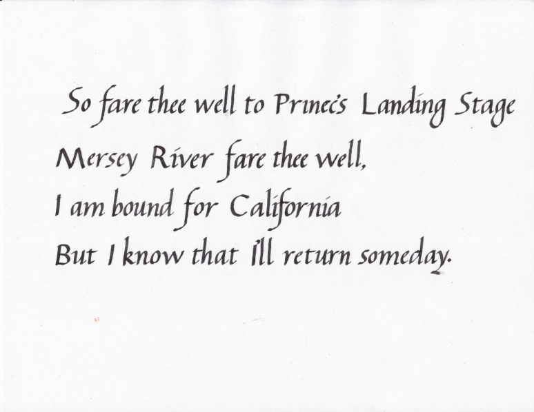
Just a couple things to post today and not much to say about them. The first one is one I’ve been meaning to do for a long time and never really finished until now. I’ve done it before with other songs but I’ve gotten better since then! Like many folk songs there are various interpretations, here are a few:
And here’s my work:

I messed up on one of the ‘e’s and wrote an ‘o’ instead! Luckily they are pretty similar letters in italic
This song has an interesting history which can be found here if you’re interested.
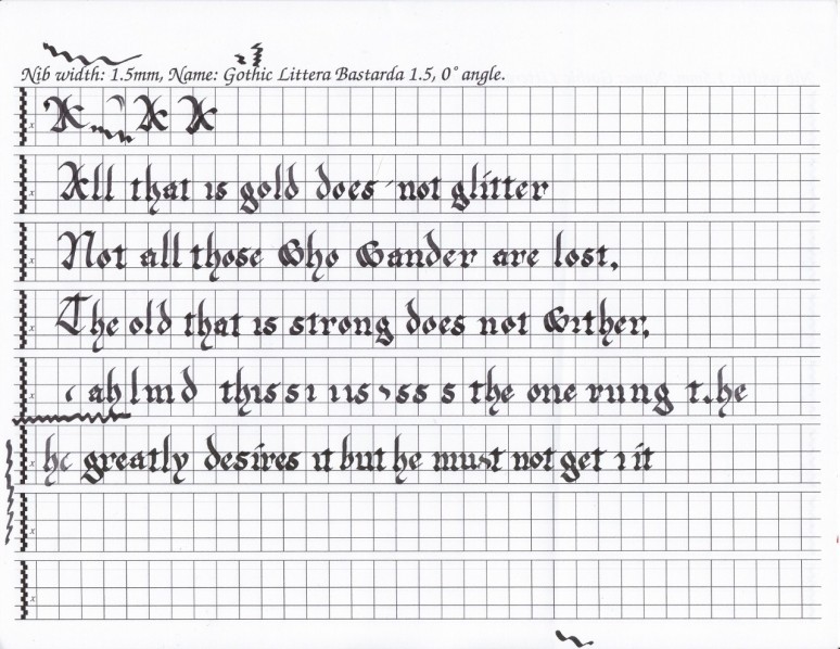
Next is another poem from Lord of the Rings, a poem by Bilbo. Found in chapter three of book two, ‘The Ring Goes South’. Perhaps not a seasonally appropriate song, but I’ve been wishing it was winter recently so there you go. With this one I tried not to worry too much about letter forms etc. and focus more on speed. It went pretty well. If it looks a little wonky now you know why:
That’s all for now! Hopefully I’ll have a scritporium for you this weekend. Until then au revoir.
Scriptorium #6 and #7
For the past couple of weeks I’ve been quite unmotivated and completely uninspired to do any sort of calligraphy. This malaise continued through last weeks scriptorium and it wasn’t until yesterday (Thursday) that inspiration and motivation mysteriously returned. So this post includes last week’s scriptorium as well as this week’s.
First was warm ups, as usual: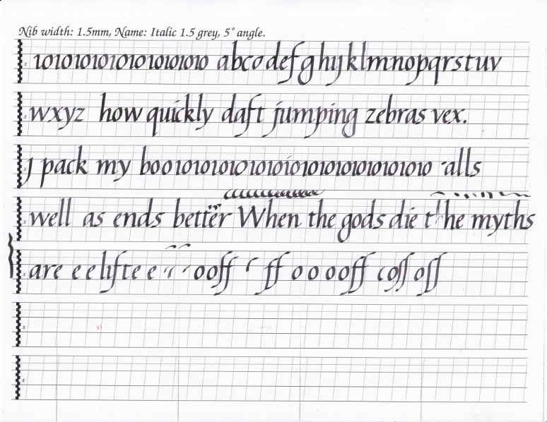 Next I decided to switch to gothic, being frustrated with my italics, and did some brief warm up:

Mostly just trying to figure out that ‘v’. The quote is one by Benjamin Franklin, I believe.
Then I wrote out the poem that Bilbo writes for Strider. Lord of the Rings is a constant source of quotes and poems for my calligraphy; needless to say I love LotR:
Lastly, because the instructor said we should be working on real work and not just practicing the alphabet etc., I made this: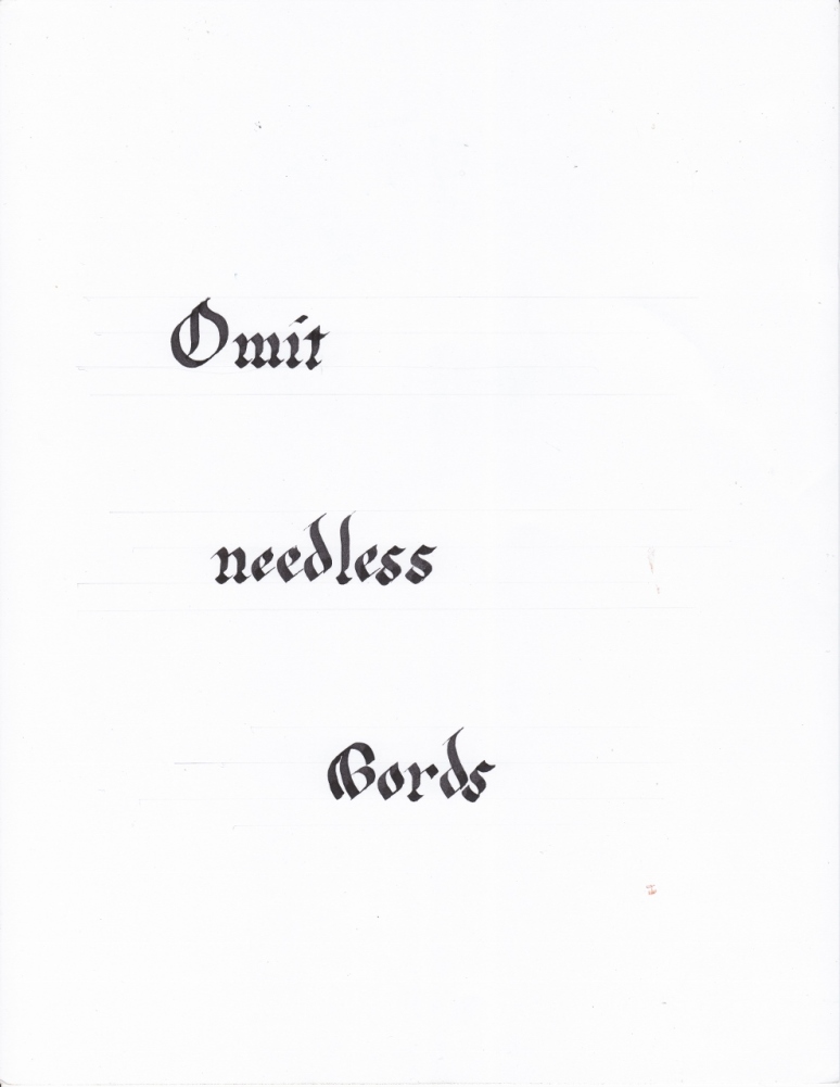
It might be familiar, if it’s not then I have some suggested reading for you: The Elements of Style, by Strunk and White. Brief, succinct writing advise. I found it quite amusing.
This week at the scriptorium I warmed up, as per usual:
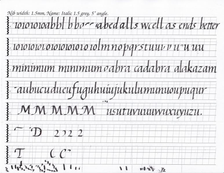
And then started working on name tags. The college where the scriptorium is held is having their annual alumni reunion next week and handwritten name-tags were requested. So for the past couple of sessions people have been working on those, about four hundred name-tags! This week I finally jumped in and made some. I didn’t quite feel ready, my capitals are still shaky, but they all turned out alright. I didn’t take any pictures of them and of course they were all left for the alumni outreach person, so I can’t share them with you. But by the time I left there were about twenty left of the four hundred. An industrious couple of weeks for everyone!
Reddit’s Quote of the Week-Jessica Hische
I joined reddit, mostly for the calligraphy subreddit, as another source for feedback and critique of my calligraphic efforts. They post a new quote every week and encourage everyone to write it out. So I gave it a go. My nib was being rather problematic for the whole quote and I struggled quite a bit with getting the ink to come out, but all those issues have since been resolved! I was so in the zone with trying to get the nib to work that I forgot to scan it in until I had penciled in the border.
I had a pretty good idea of what I wanted the border for this piece to be before I began: a long red bar across the top, supported by narrow lines of black on either side, and an open space on the bottom bordered by red bars that would be filled with spirally flowering vines. However, as is often the case, my plans changed as I worked. I used the tutorial here for the vines and flowers and the one here for the leaves. When I finished penciling in the border I thought it would be cool if the vines went up the sides of the border and wrapped around it. So that’s what I drew. Then working on the vines on the bottom it seemed that they needed something to grow around as well, so I added another bar across the middle. If you’re having a hard time imagining all this just look at the picture:

As I’ve said I am not too pleased with the writing here, as I was struggling with the nib the whole time, but I suppose the border will draw attention away from that, a lucky happenstance!
As you can see I penciled the whole thing in and then figured out where the vines would go over the border, or under the border. If you have some time here is some elucidation of the quote, as well as a fantastic analogy:
Next I inked the vines and leaves going up the sides:

I didn’t feel obliged to follow my pencil lines exactly as they were more of an idea of the layout rather than strict guidelines.
Next I inked the two big vines on the bottom. I was going to fill in the flowers with red, same as the horizontal bars (I thought it would nicely complement the blue paper and ink) but as I worked I realized perhaps this would make them seem like berries rather than flowers; so I tried to modify their shape in the bottom vines to make them look more petal-like. We’ll see if that worked or not.

I wanted to make the bottom ones thicker and bigger, they probably grew first and are now sturdy and strong!
Then I added the border in black. The red bars I made with my 1.5mm Leonardt Round Hand nib by just running the nib, full width, along a ruler being careful not to go through the vines.
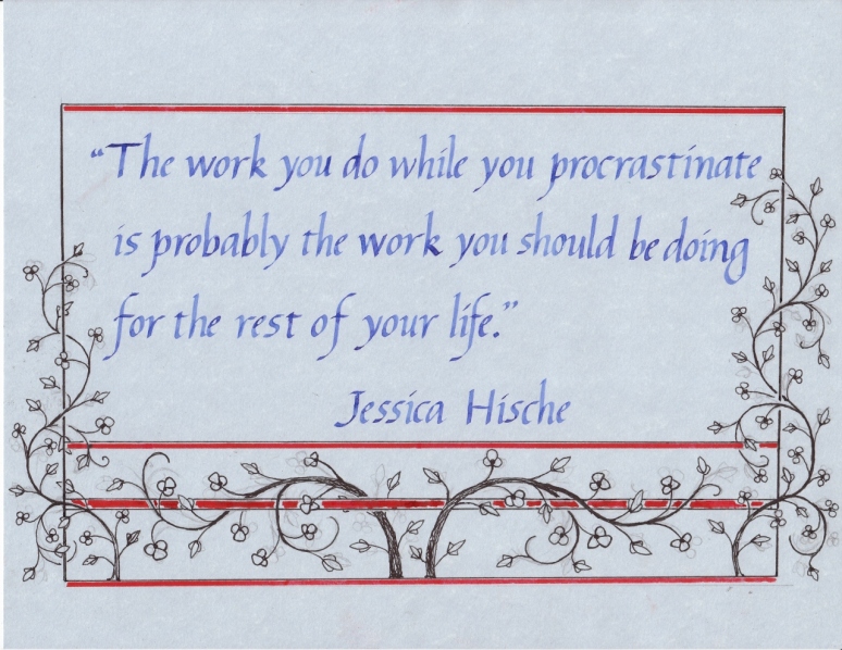
I couldn’t get the whole length of the middle bar, as you can see. But no big deal. The whole thing is turning out somewhat better than I expected!
I filled in the rest of the red, and gave each of the red bars a black outline:
All that was left to finish the piece was filling in the flowers with red, and adding little hooks and scribbly lines where it seemed like it needed them. It’s all a very open, loose, gut feeling, kind of process. A little hook here, a little hook there, some scribblies on the ends of the leaves and Ta-da! A finished border:
And that’s it! Thanks for reading, hopefully that gave you a somewhat coherent look into my process, and the steps it took to finish this piece. If you want to find me on reddit my reddit-name is piejesudomine (that’s a Monty Python reference, for those of you who don’t know)
Again I hope to post about the next scriptorium session over the weekend, but we’ll see how the cards fall.
Scriptorium #5
First was warm ups, as per usual. I really like imagining daft zebras jumping, and I’m sure it would quickly vex anyone who was in the area especially if you were sitting quietly writing out ioioioioio’s and then in through the door bursts a dozen zany zebras prancing away, getting all up in your business. Quite vexing.
I was having some trouble with my nib, at home, but I had the instructor test it out and it worked fine. I think I was just using too heavy a hand. My feather touch needs developing, apparently. So I’ll work on that. The college need several hundred, I believe, name-tags for an alumni reunion. And so we were delivered a huge list of names. It wasn’t imperative that we do them all, but anything we could would help. The reunion thing isn’t until early June so we have some time to get it done. I need to work on my majuscules (capital letters) before I write anyone’s name! I’ve mentioned before that I haven’t yet done a real study of capital letter but it looks like now’s the time to study up!
In addition to any name tag-writing we’d be willing to do, the instructor passed out this sheet of flourishes, chancery italic flourishes to be precise, as a way to loosen up and practice without being so concentrated and precise. He said it was from a book of instruction by Arrighi called Operini. I did a little searching and you can find the whole book as a pdf.zip file here. This is page 34, a list of Italian honorifics and titles (e.g. Mr., PhD. MD. etc):
So I copied some, and also practiced some majuscules (the ‘easier’ ones):
It was a lot of fun, all those swoopy curvy lines! I found that there was a pattern, and certain rules to it. Even though it may look just like random swirly shapes it actually is attempting to frame and underline, emphasize, certain letters/phrases. Many of the downward curves are similar, and the horizontal lines are parallel and even, dictating the letter height or filling up empty space between descenders or ascenders. I fully intend to continue this line of practice. It’s too much fun not to, and it will really add some flair and class to my work. Or at least I think so. Here’s some more:
Next I practiced lyric to another song, The Leaving of Liverpool. I am doing a series, I suppose you could call it, of song lyrics. I got so caught up in the letters and words that I realized I was just copying out the song instead of doing the chorus, which was my intention. Oh well, it’s just more practice:
That’s all for now. I do have another post in the works, look for it early this week.
New Blog-The Golden Atheneum
I have made a new blog and I’ll only tell you about it once, because I’m not big a fan of constant self promotion. It’s called The Golden Atheneum. There I’ll be sharing images from the Golden age of Illustration (if you don’t know what that is read the ‘Welcome and Greetings post) as a study of the artists and the movement; so that’s where the ‘Golden’ part of the title comes from. Atheneum comes, of course, from the Greek Goddess Athena. Atheneum is defined thusly: 1. an institution for the promotion of literary or scientific learning. 2 a library or reading room. So that sort of fits my idea of a gallery of marvelous illustrations. Also I’ve always liked Athena.
I have a very specific idea of what the blog will be and I’m excited to see it all coming together. Finding all the images and downloading them and sorting them and uploading them takes a surprising amount of time, so I won’t be updating it too frequently, or on a regular basis (not that I keep any sort of schedule for this blog, but that one will probably be more infrequent) but I hope the content I do post will be enough to tide you over.
And, to add a bit to the post, some calligraphy practice. When I came home from the scriptorium, yesterday, I decided to try out my biggest nib. It’s a Leonardt Roundhand Square Cut nib, for those of you who’d like to know such things. It’s 3.7mm; now that might not sound too big, but these pictures will help illustrate. These are 8.5×11 sheets:
It took a bit of getting used to and was almost more like drawing than writing, I had to move my whole arm and not just the wrist. It made it much easier to see where I was off with my letters, and was really helpful as far as seeing where I needed improvement.
I was reading The Elements of Style, by Strunk and White, and really liked the brevity and clarity it had. I thought it would be interesting to write out some of their rules in the most ornate, dramatic lettering I knew, and give it an excessively complex border: the exact opposite of the rules which are simple and straight forward. If you don’t know about The Elements of Style I would recommend it, I found it very helpful and surprisingly amusing. So that is what this practice is working towards.
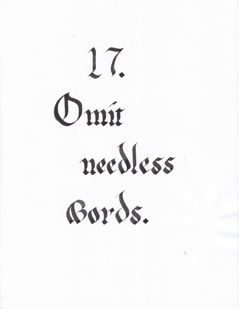
And here it is again, on a new page. It turned out rather well, although I’ll try to find a more ornate capital ‘O’.
Here’s some writing with my usual nib size, (and from a good while ago) for comparison.

This is the start of the poem about Beren and Luthien, found in the Fellowship of the Ring, by J.R.R. Tolkien
That’s all for now. Check out my new blog if you have an interest in illustration, or nice pictures, or the late 19th early 20th centuries. I’ll see if I can add it to the blogroll too. I hope to post about the scriptorium this weekend sometime.
Scriptorium Session #4
Time to share my work from last weeks scriptorium session. First up is warm-ups as usual, in addition to the daft-zebras pangram I used the famous typesetter’s pangram, with a little twist!
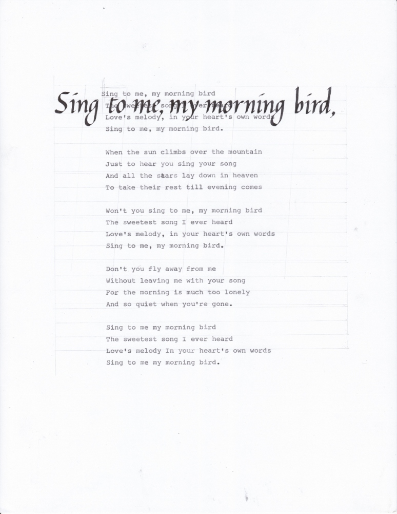
Next I practiced a couple of projects I had planned for the evening. I’ve done something like this before and I really liked how it turned out, so I thought I’d try it with some other songs:
Here are the two songs, just so you can hear them.
Here’s the final version of the Morning Bird piece: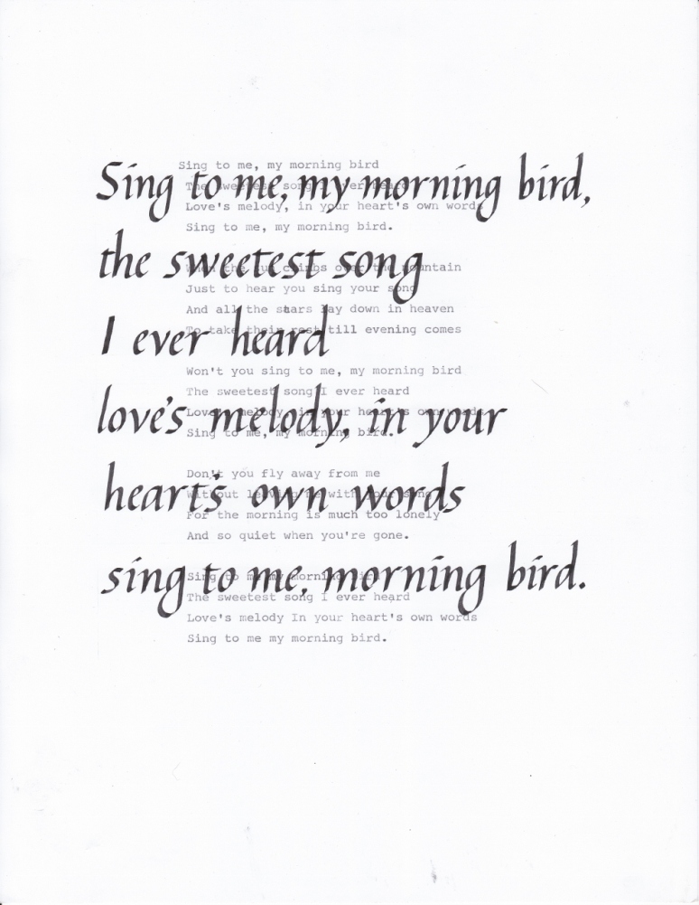
Unfortunately I forgot a word (can you find it?), so I’ll just chalk this up to practice. I also plan on experimenting with a horizontal layout, so we’ll see how it goes.
After messing up on the Morning Bird piece I drew out the guidelines for the Leaving of Liverpool, but I misjudged and made 4 lines instead of the 5 I realized I needed, and they weren’t in the right place aesthetically: if I added a line to the top or bottom the margins would be all messed up and I got a bit frustrated.
So I decided to switch tracks from italic and work on my gothic littera bastarda:
I must make a disclaimer here: I have never yet made a formal practice of the majuscule (capital) letters of either italic or the gothic hand so all the majuscules I’ve done so far have been rather on the fly interpretations of the ductus and examplars I’ve found. While not exactly a problem this is an inconvenience. I have not yet felt quite comfortable with the minuscules of either alphabet to move on the majuscules but I’m getting closer and closer, so we’ll see what the future holds.
I realized the Riddle of Strider wouldn’t quite fit on the page comfortably so I worked on something else: the opening paragraph of the Ainulindale, from the Silmarillion. Ever since finding the Quenya translation of the Ainulindale at quenya 101 I’ve had the idea of turning it into an illuminated manuscript and somehow incorporating the Quenya in the Latin alphabet (rather than in tengwar) as well as the translation and the original text. However figuring out how to incorporate four things into one document is proving somewhat challenging. So I’m going to do the tengwar quenya on one page with the original text on another page perhaps with the quenya in the Latin Alphabet inserted between the lines of the original, or maybe not. I’m having a hard time working it out, so if you have any ideas I’d be happy to hear them! Anyway here’s the start of the original Silmarillion:
I left spaces for the first decorated initial, although looking at it now it doesn’t look like enough space; and for the majuscule letters, which I want to do in alternating red and blue inks, to mimic medieval manuscripts. But it got smudged somehow, and is a little wonky so I’ll probably end up doing it again. I did get some new paper which I used for this piece, and I think it works pretty well (e.g. it takes the ink pretty well, not much bleeding/feathering). It’s from Canson and is called just ‘Calligraphy‘ an comes in a pad of 50 sheets and has four different colors, which is pretty cool; I’ve been looking for some cream/ivory paper so I don’t have to work on bright white all the time and this fits the bill!
Scriptorium Session #3
Quick! Before the next session on Thursday let me share what I did last week. Last week we made weathergrams to hang around campus for the end-of-the-year celebration. Created by Lloyd Reynolds weathergrams are “based loosely on the ideas of Japanese haiku, Reynolds’ weathergrams now have a permanent place in the Pacific Northwest calligraphy history. He defined the weathergram text as a sudden insight, so brevity—10 words or less—was essential. The subject matter should be seasonal, and the resulting vertical flag, preferably made of brown paper grocery bags, should be hung on a tree branch in “the garden, at a campsite, or along a mountain trail” and left outdoors between solstice and equinox, or equinox and solstice. The three-month weathering of these written statements was essential to the weathergram, a “weather-writing,” as it started its journey back to nature.” from the Reed College website. I left mine there to be hung up around campus so I don’t have a picture to share, but I do plan on making more and hanging them up around my yard. I think it’s a really neat idea.
First, as usual, was some warm ups, with a new pangram:
Next I practiced the piece I was going to work on that week to figure out spacing as well as how to best center it on the page. I’ve done something like it before and really liked how it turned out, so I thought I’d do it again, with a different song and a much better grasp on italic.
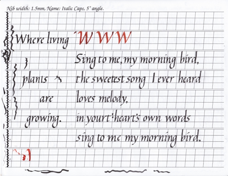
I remembered to dot the ‘i’s this time, so maybe it’s not too much of an issue! “Where living plants are growing” was what I put on my weathergram. It’s from the Waldorf Morning Verse.
And lastly I begun work on the final project! It’s lyrics to a song by Forrest Sun that I feel are quite soothing and touching.
<iframe width=”420″ height=”315″ src=”//www.youtube.com/embed/YzTc6Suqxe8″ frameborder=”0″ allowfullscreen>
Unfortunately there wasn’t enough time in the scriptorium to finish it and I haven’t yet gotten to it at home so it remains woefully incomplete. I might just end up redoing the whole thing because I really am not fond of the beginning ‘S’.
That’s all for now, but in other news I spent most of Saturday working on proofs of the Quenya Textbook, so I’ll have some more to share on that soon!
A Brief Survey of Gothic
I meant to post this yesterday, oops!
I took some time this past week to work on my gothic littera bastarda and I thought I’d share some long term progress. This first piece was done back in January, I believe I’ve shared it before but here it is again for comparison’s sake.
And another Tolkien poem, from the dwarves this time. This was done in early April, it might have been exactly a month ago. It wasn’t a finished piece, it wasn’t meant to be, but I did want it to be presentable. I was trying to see if this layout would work, which it does, sort of. Also, don’t mind the majuscules (capital letters) I still haven’t worked too much on them in gothic or in italics and mostly just improvise poorly from the exemplar.

I’m not sure when this was done, but sometime between the last one and the next one. The text is from a Monty Python skit. With this one I wanted to see if I could write a whole page of text and have it be consistent and keep it looking nice, without wearing myself out. Which also kind of worked. Again, disregard the majuscules, though they’re getting better.
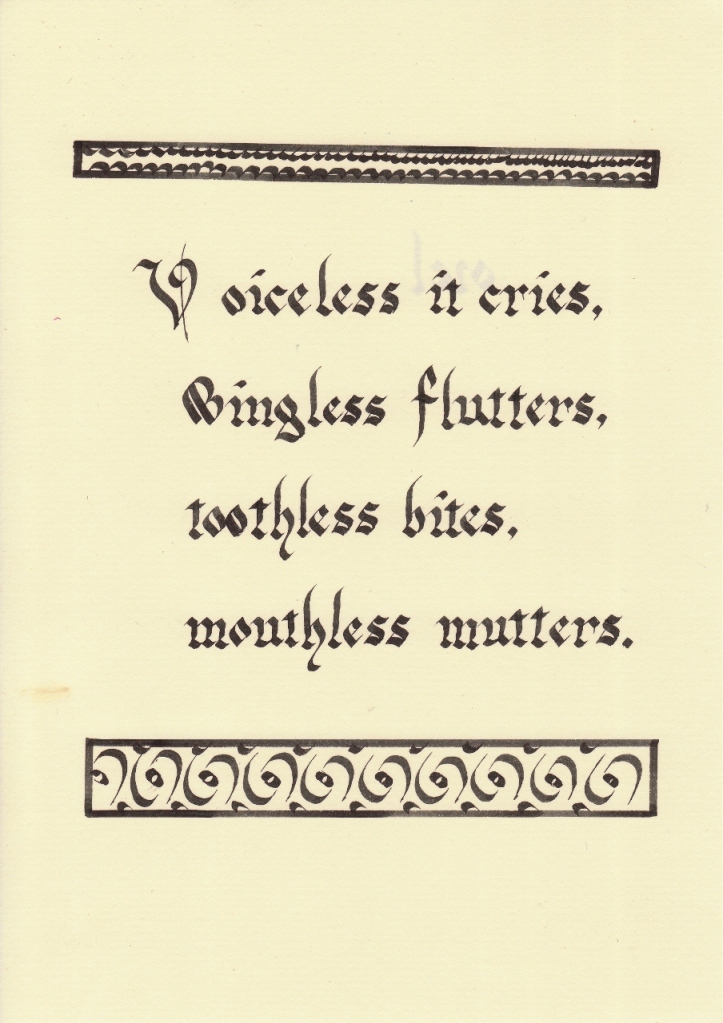
This was done on April 2nd, as far as I can figure out (I should probably date my work). It’s one of the riddles from chapter five of The Hobbit: Riddles in the Dark, when Gollum and Bilbo have their riddle game. I plan on doing all of the riddles in a similar manner at some point, after I improve a wee bit more.
And lastly, a piece I did this week. It’s from Walden, by Thoreau, explaining is reasons for living in the woods. I was focusing on the letter forms, trying to get them as close to the exemplar as possible, and trying to keep the letters between the lines, especially at the bottoms. It mostly worked out, and I’m quite proud of this piece! Although, just to be a bit critical, looking at it now on-screen I could have worked more on keeping the letters vertical, especially the d‘s.
That’s all for now. I do have some work from the scriptorium to share with you this weekend, as well as something else entirely…
Search
-
Wet pages
Dried Pages
Categories
-
Join 49 other subscribers


